0 com

Moving..

Please visit my new site that is both a portfolio and a blog.

aaronmalmedal.com
0 com

A Work in Progress....

This is an animation for my graphic communications class depicting a typical day in the studios at USC. Needs some further editing, I will post a final later.

Class Animation Project from aaron m on Vimeo.

0 com

Launtner

05


Today we went to the Goldstein House by Lautner in my Historic Houses of Los Angeles class. I have to say this was truly one of the most amazing buildings I have ever gone too. Don’t have much time to share a lot of information, I will post more later, but I thought I would share some images.


More Pictures


0 com

A Pavilion....


[definition] a free standing structure whose architecture makes it an object of pleasure.

The purpose of this pavilion was to create an outdoor structure that can be enjoyed year round. The pavilion is comprised of two spaces that take on new characteristics as the months change. The northern space is more open, providing views to the north, shading the southern sun, and accommodating the light northern breeze. The southern space shades the summer sun but allows the winter sun inside, allows for views to the south, and the striations in the façade provide a gentle breeze. The overall form of the pavilion twists and turns to accommodate blocking the sun, providing entry, enclosing space, partitioning space, and creating seating. The form is also striated by contours that allow light to pass into the pavilion and decorate the ground plane with constantly changing shadows. The shadows create an ever changing atmosphere inside the pavilion, helping marking the passage of the seasons.

See More....
1 com

nearing the end…

For Photoshop
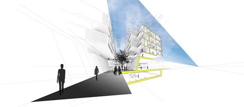
Perspective of public dining / entry corridor
 
 
Finals review is coming up soon and we were instructed to begin to think of the drawings that we would like to compose to represent our projects. I think instead of ‘photo-realistic’ renderings I am going to create renderings that are more like line drawings like the image above. This was my sample to show my professor tomorrow and gain some feedback.


For Photoshop
Zoomed in view
0 com

progress…


Front with peoplebw


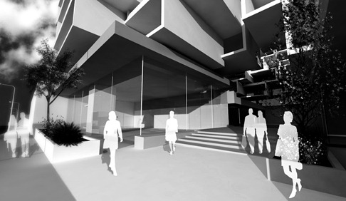
Yesterday the studios held a progress critique that was intended to explore the building systems and structural ideas within our mixed use designs. Yet the critique turned into a much more in-depth investigation into our overarching conceptual and urban ideas. Here are some of the drawings and renderings I produced for the review.  I left the review with many new ideas to incorporate including making the Santa Monica elevation more porous in the housing clusters.


Read More…


Section

Detailed Section of varying types of circulation / social space
 

2 com

Midterm Presentation

wb
 
Two weeks ago was midterm presentation. This consisted of my peers and myself staying up for endless hours to produce work demonstrating our goals for the project. We were required to present ideas about how our project operates urbanistically demonstrating this through models, drawings, and renderings.  My presentation was received well and the focus of my design for the next few weeks will deal with the connection between my private housing and the more public ground plane (how can these two merge or create a third condition?)  I am excited for the development of my project because I think it has a lot of potential but still needs a lot of resolution and problem solving. Progress to come soon.


Read More…


Section 01

Section illustrating the seamless transition from the street to the interior of the project. The section is cut through the public social void of the housing clusters.